

AI-Powered Daily Journal: Day 3 - Insights Dashboard

Projects in this week’s series:
This week, we build an AI-Powered Daily Journal that writes markdown entries, analyzes your mood with AI, and visualizes your emotional patterns over time!
Day 1: Markdown Journal Writer
Day 2: AI Mood & Theme Analyzer
Day 3: Insights Dashboard (Today)
Today’s Project
Welcome to the finale! We’ve built a journal with AI analysis. Today we’re creating a beautiful Streamlit dashboard with mood charts, word clouds, and AI-generated monthly summaries!
You’ll visualize your emotional journey and discover patterns you never noticed!
Project Task
Create a Streamlit insights dashboard with:
Mood-over-time line chart (interactive with Plotly)
Word cloud from all journal entries
Monthly summary cards (AI-generated)
Theme frequency chart
Entry statistics and streaks
Filter by date range
Export insights as PDF
Beautiful, intuitive interface
This project gives you hands-on practice with Streamlit, data visualization, Plotly charts, word clouds, dashboard design, and building data-driven applications — essential skills for analytics and insight tools!
Expected Output
Running the dashboard:
streamlit run dashboard.pyBrowser opens with dashboard showing your mood in a graph:
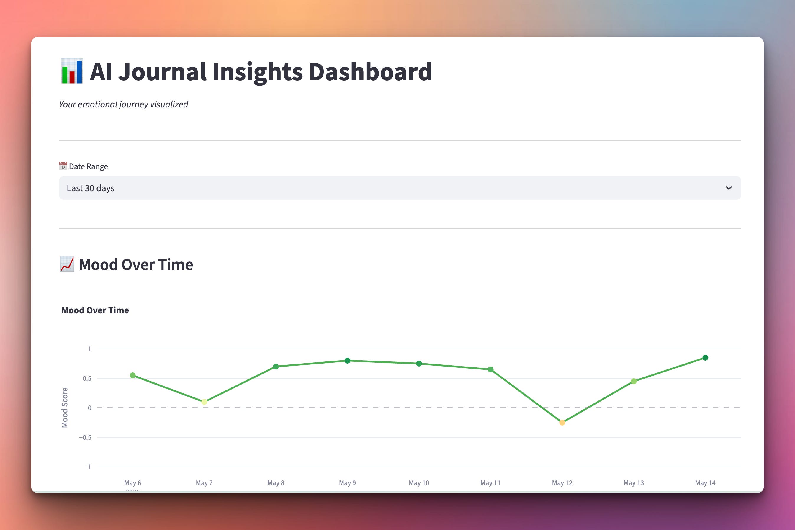
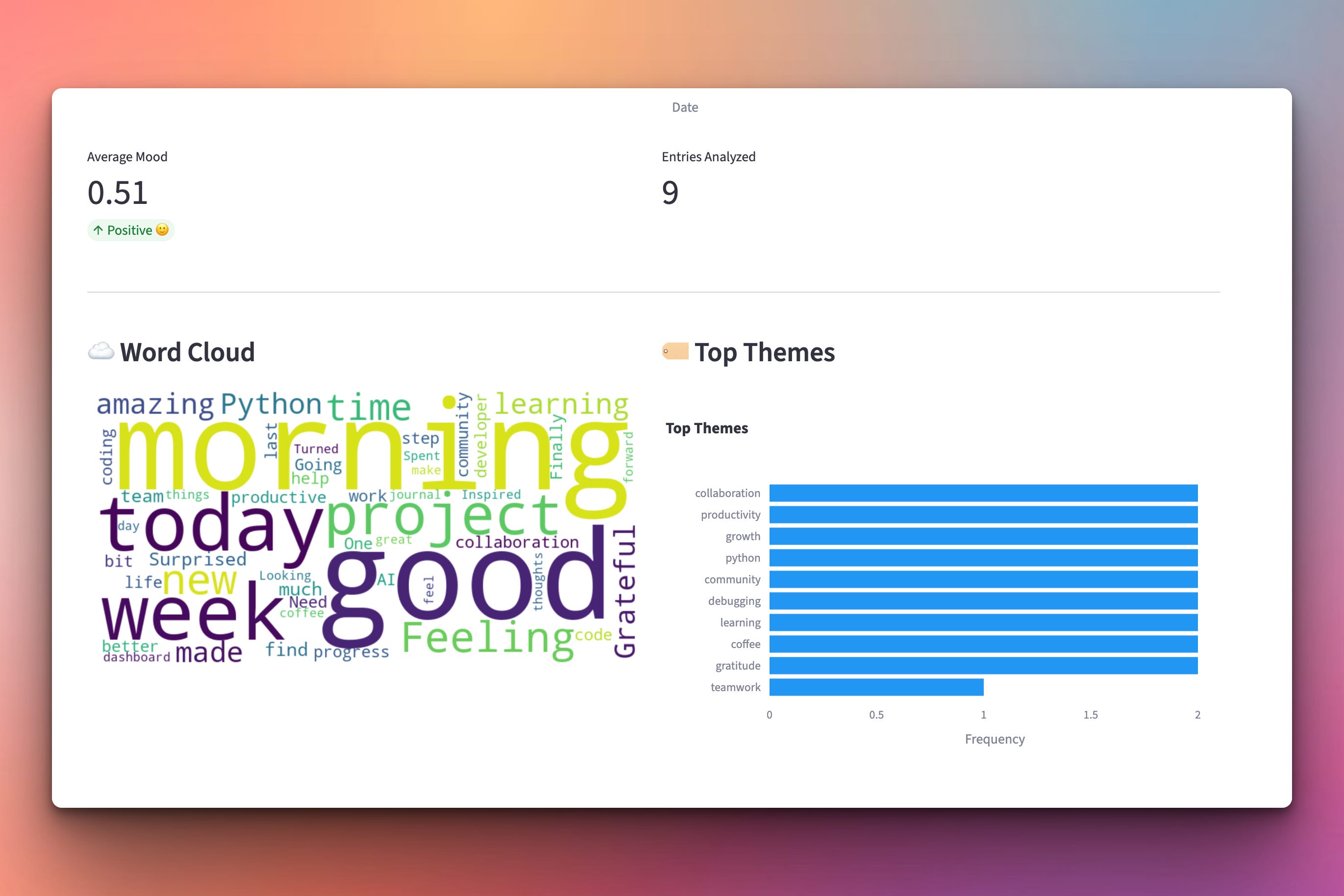
Scrolling down the webpage you will find the score for the average mood, a word cloud showing the most used words in your journal, and the top themes you have written about:
Setup Instructions
Install Required Packages:
pip install streamlit plotly wordcloud langchain-google-genaiSet Google API Key:
export GOOGLE_API_KEY="your-key-here"Run the dashboard:
streamlit run dashboard.pyBrowser automatically opens to
http://localhost:8501
Make sure you have some jornal entries in the same directory with the dashboard.py file. Here are some sample files you can use:
Understanding Streamlit Layout
Dashboard structure:
Keep reading with a 7-day free trial
Subscribe to Daily Python Projects to keep reading this post and get 7 days of free access to the full post archives.