

Build a Weather Data Analytics & Forecasting Tool: Day 2 - Weather Data Analysis & Visualization
Level: Intermediate

Projects in this week’s series:
This week, we progressively build a weather data analytics and forecasting tool with Python.
Day 1: Weather Data Collector
Day 2: Weather Data Analysis & Visualization (Today)
Day 3: Advanced Analytics & Predictions
Today’s Project
Yesterday we built a data collector that saves weather information to CSV files. Today we’re analyzing that data — creating charts, identifying patterns, comparing cities, and turning raw numbers into visual insights!
We’re transforming your CSV data into compelling visualizations that reveal weather trends, patterns, and comparisons at a glance!
Project Task
Create a weather data analyzer that:
Loads weather data from CSV files
Calculates statistical summaries (averages, highs, lows)
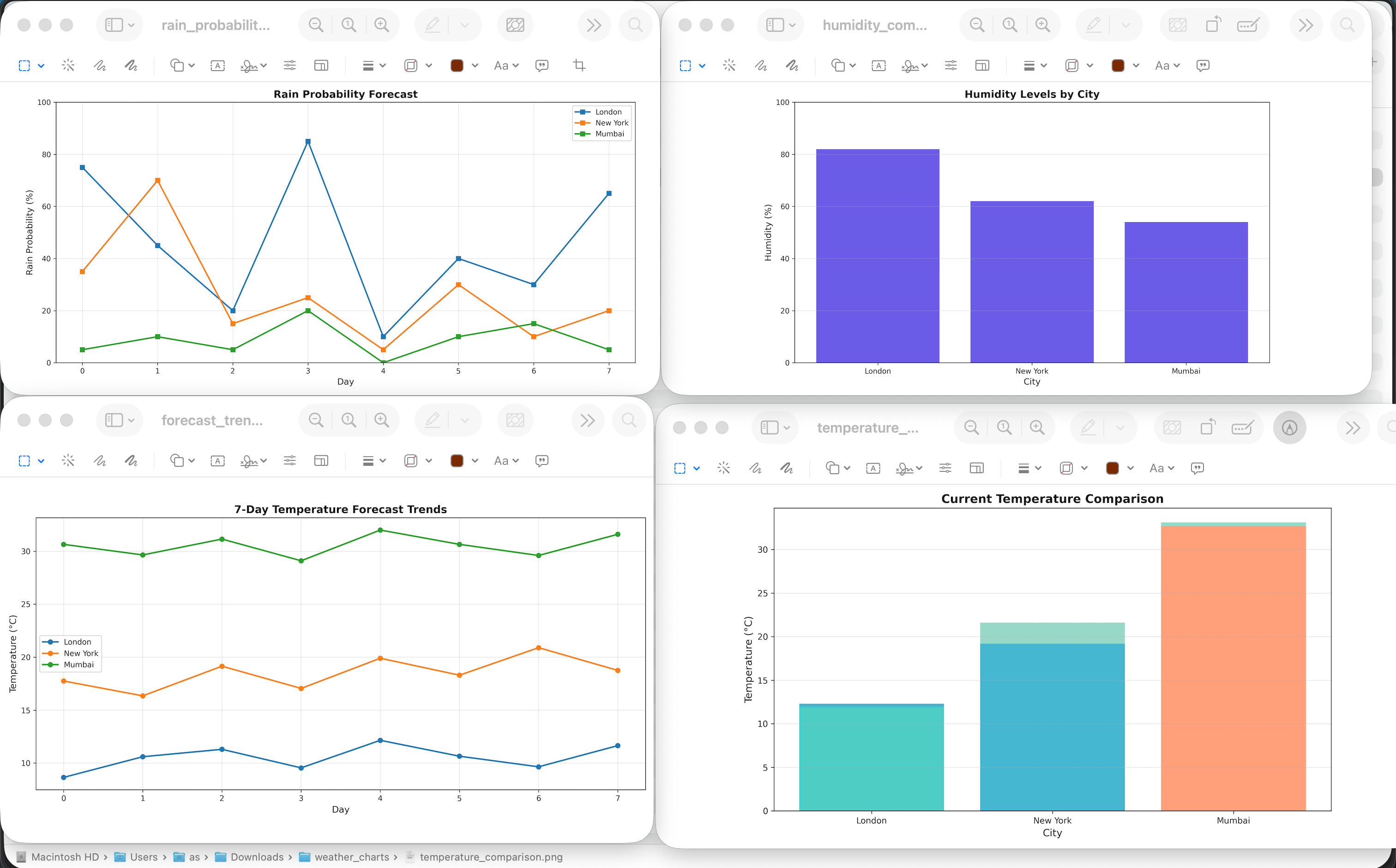
Creates temperature trend line charts
Generates comparison bar charts for multiple cities
Visualizes precipitation probability patterns
Shows humidity and wind speed distributions
Creates multi-city comparison charts
Saves all charts as image files
This project gives you hands-on practice with pandas data analysis, matplotlib visualization, statistical calculations, chart creation, and building data analytics pipelines — essential skills for any data science project!
Download these sample CSV data here if you don’t have them.
Expected Output
The app will produce several PNG charts in the local directory:
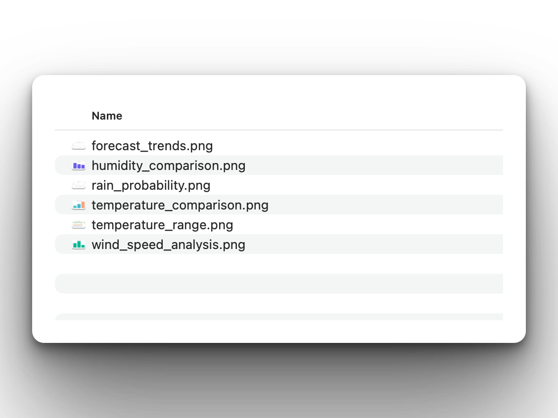
Here is how they look:
Coming Tomorrow
Tomorrow we’re adding advanced analytics — moving averages, correlation analysis, seasonal patterns, simple forecasting with linear regression, and comprehensive PDF reports with all charts embedded!
View Code Evolution
Compare today’s solution with earlier versions and see how we’re building a complete weather analytics system.
Keep reading with a 7-day free trial
Subscribe to Daily Python Projects to keep reading this post and get 7 days of free access to the full post archives.