

Weather Climatology Dashboard: Day 1 - Single city, monthly averages
Build a data dashboard showing the annual climate profile of a any city in the world.

Projects in this week’s series:
This week, we build a Climate Dashboard — a Streamlit web app that fetches historical weather data from a free public API and turns it into beautiful climatology charts, culminating in a WeatherSpark-style multi-city comparison by Friday.
Why build this? Because climate data is one of the most rewarding kinds of data to visualize — the seasonal cycle is right there in the numbers, but you need the right chart to see it. And this week teaches the exact “same UI, growing sophistication” pattern that shows up in real-world data apps every day.
What you’ll learn: This series teaches you how to consume two APIs together (geocoding + weather), aggregate time-series data by different time buckets, and build progressively better charts with Plotly. By Friday, you’ll be able to compare the climate of any two cities side-by-side in a single interactive chart.
Why this matters: Climate visualization is the exact shape of dozens of real data problems — sales seasonality, website traffic patterns, energy consumption cycles, stock market seasonality. Master this pattern and you master a huge class of dashboards.
Day 1: Single city, monthly averages (Today)
Day 2: Daily climatology with filled temperature bands
Day 3: Multi-city comparison (WeatherSpark style)
Today’s Project
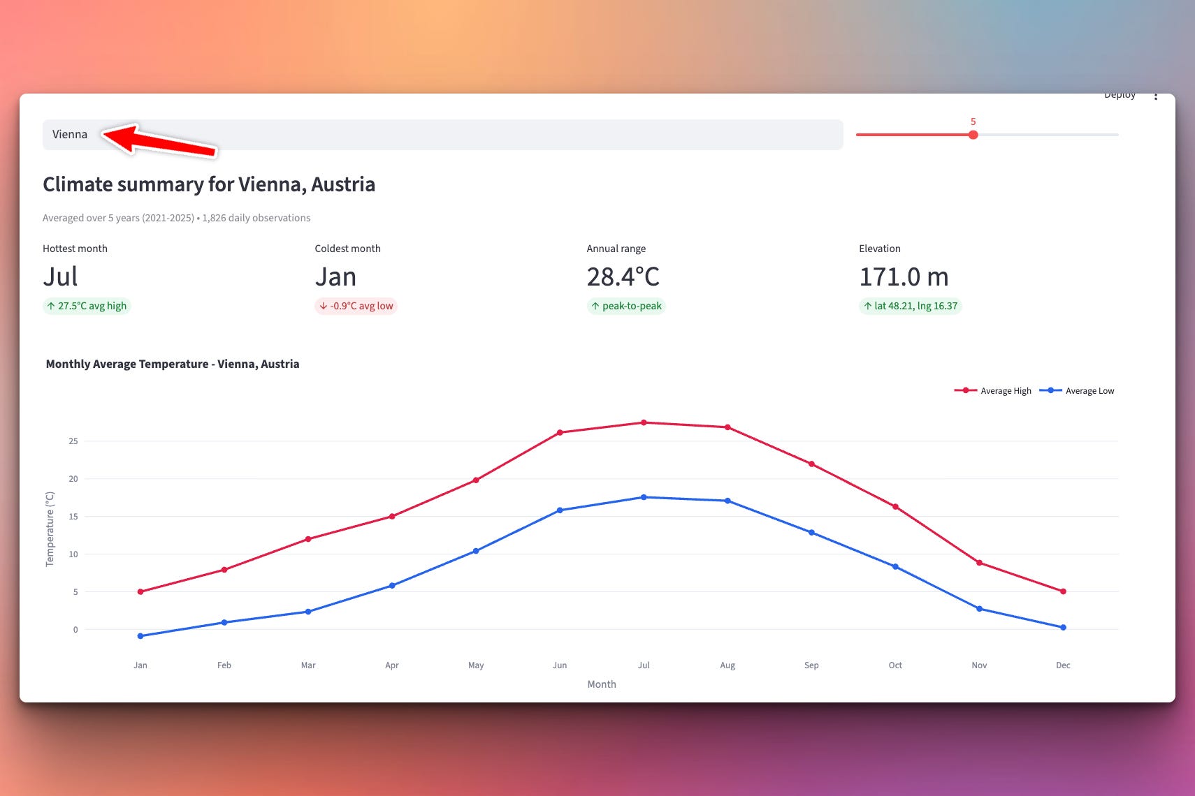
We start with the foundation: the annual climate profile of a single city, shown as a 12-month line chart of average high and low temperatures.
Type “Vienna” — see Vienna’s climate. Type “Tokyo” — see Tokyo’s. Type “Cairo” — see Cairo’s. The app fetches five years of daily data, averages it by month, and plots the seasonal cycle.
By the end of today you’ll have real climate data on screen for anywhere in the world, working from two free public APIs with no API key required.
About the Data
Two free, public APIs from Open-Meteo — both need no signup, no API key, no credit card:
Historical Weather API: archive-api.open-meteo.com
ERA5 reanalysis data from 1940 to today
Global coverage (works for any lat/lng on Earth)
Daily aggregates: max temp, min temp, precipitation, wind, humidity, and more
CC BY 4.0 license
Free tier: ~10,000 requests/day (way more than we’ll need)
Geocoding API: geocoding-api.open-meteo.com
Turns “Vienna” into
latitude: 48.21, longitude: 16.37Returns country, timezone, elevation, population as bonuses
Also free, also no key
Together they let us build a location-agnostic climate app in under 300 lines.
Project Task
Build a Streamlit app that:
Takes a city name as text input
Geocodes the city into lat/lng using Open-Meteo’s geocoding API
Fetches N years of daily historical temperatures for that location
Aggregates the daily data into 12 monthly average high and low temperatures
Displays the result as a Plotly line chart with two traces (high and low)
Shows a summary strip with 4 metric cards: hottest month, coldest month, annual range, elevation
Includes a small map showing the city location
Caches API results so repeat interactions are instant
This project gives you hands-on practice with requests + query parameters, JSON parsing with parallel arrays, dict-based bucketing, defaultdict, Plotly graph_objects, Streamlit’s metric / columns / plotly_chart widgets, and @st.cache_data for performance.
Expected Output
Running the app:
streamlit run climatology.py
Type a city name at the top (e.g., Viena). You get:
Setup Instructions
Install dependencies:
pip install streamlit plotly requests
Run:
streamlit run climatology.py
Your browser opens automatically at http://localhost:8501.
Understanding Two APIs Working Together
A common real-world pattern is that the API you actually want to hit needs data the user doesn’t have. The user knows the city name “Vienna” — but the historical weather API needs precise coordinates. That means two API calls, chained.
User types "Vienna"
       ↓
Geocoding API → { latitude: 48.21, longitude: 16.37, ... }
       ↓
Historical API → { daily: { time: [...], temperature_2m_max: [...], ... } }
       ↓
Chart
Both calls happen in the backend of your Streamlit app. The user just sees a text box and a chart — the two-hop journey is invisible.
This is the pattern for any location-aware data app. Weather, air quality, timezone lookups, restaurant search, real-estate prices — all of them start with “turn this address/city into coordinates first.”
Understanding requests with Query Parameters
Both APIs use standard HTTP GET with query parameters. Our helper wraps requests.get cleanly:
@st.cache_data(ttl=86400)
def geocode_city(name):
    response = requests.get(
        "https://geocoding-api.open-meteo.com/v1/search",
        params={"name": name, "count": 1, "language": "en", "format": "json"},
        timeout=10,
    )
    response.raise_for_status()
    data = response.json()
    if not data.get("results"):
        return None
    return data["results"][0]
The params={...} argument tells requests to add these as query parameters — it will URL-encode them properly, so we don’t have to think about escaping. Never manually build a URL by concatenating strings. ?name=New%20York%20City becomes just params={"name": "New York City"} — Python handles the encoding.
response.raise_for_status() throws immediately on 4xx/5xx errors — better than silently getting a broken response and confusing yourself later.
data.get("results") safely returns None if the key is missing, instead of crashing. Different APIs are inconsistent about their “no results” behavior — some return an empty array, some omit the key entirely. .get() handles both.
Understanding the Archive API Response Shape
The Historical Weather API returns something like:
{
  "latitude": 48.2,
  "longitude": 16.37,
  "elevation": 190.0,
  "timezone": "Europe/Vienna",
  "daily": {
    "time":              ["2020-01-01", "2020-01-02", "2020-01-03", ...],
    "temperature_2m_max": [5.4,         6.1,         3.8,          ...],
    "temperature_2m_min": [-1.2,        0.8,         -2.4,         ...]
  }
}
Notice something specific: daily contains three parallel arrays, not a list of daily record objects. Element i in each array belongs to the same day.
This is a common shape for time-series APIs — it’s more compact than an array of objects (saving bandwidth on repeated key names), but requires you to iterate them together with zip():
for date_str, tmax, tmin in zip(daily["time"],
                                daily["temperature_2m_max"],
                                daily["temperature_2m_min"]):
    # date_str = "2020-01-01", tmax = 5.4, tmin = -1.2
    ...
zip is the tool for parallel arrays. Any time you see this shape, zip is what you want.
Understanding the Aggregation Idea
The core teaching point of today: grouping daily data into monthly buckets.
We fetch ~1,800 daily observations (5 years × ~365 days). We need 12 monthly averages. The pattern:
from collections import defaultdict

buckets_max = defaultdict(list)
buckets_min = defaultdict(list)

for date_str, tmax, tmin in zip(daily["dates"], daily["max"], daily["min"]):
    month = int(date_str[5:7])          # "2020-07-14" -> 7
    if tmax is not None:
        buckets_max[month].append(tmax)
    if tmin is not None:
        buckets_min[month].append(tmin)

avg_max = [sum(buckets_max[m]) / len(buckets_max[m]) for m in range(1, 13)]
avg_min = [sum(buckets_min[m]) / len(buckets_min[m]) for m in range(1, 13)]
Three concepts worth internalizing:
defaultdict(list)— a dict where any missing key auto-initializes to an empty list. Noif month not in buckets: buckets[month] = []clutter. It just works.date_str[5:7]— string slicing to grab the month digits directly. Since Open-Meteo returns dates inYYYY-MM-DDformat, positions 5 and 6 are always the month. Fast and nodatetime.strptimeoverhead needed.The pattern — “group by X, aggregate within each group” is the most common data pattern in the world. This is
pandas.groupbyunder the hood; this is SQL’sGROUP BY; this is what MapReduce is doing at scale.
Once you see this pattern once, you see it everywhere.
Understanding Safe Aggregation with None Values
Open-Meteo occasionally returns null for a day where the reanalysis is missing (this is very rare, but real). If we don’t guard for it, a None value slipping into a bucket crashes the average calculation.
Two guards handle this:
# Skip Nones when appending
if tmax is not None:
    buckets_max[month].append(tmax)

# Guard against empty buckets (e.g. very short date ranges)
def _avg(bucket):
    return sum(bucket) / len(bucket) if bucket else None

avg_max = [_avg(buckets_max[m]) for m in range(1, 13)]
If a whole month happens to be empty (say, the user picks a very narrow date range), we return None for that slot. Plotly happily renders a gap in the line instead of crashing.
This is the difference between fragile code and robust code. Fragile code assumes the data is perfect. Robust code assumes gaps exist and handles them gracefully. Real-world APIs always have gaps.
Understanding Plotly Chart Basics
We use plotly.graph_objects.Figure for maximum control. The pattern:
import plotly.graph_objects as go

fig = go.Figure()

fig.add_trace(go.Scatter(
    x=MONTHS,
    y=avg_max,
    mode="lines+markers",
    name="Average High",
    line=dict(color="#e11d48", width=3),
    marker=dict(size=8),
    hovertemplate="%{x}: <b>%{y:.1f}°C</b><extra></extra>",
))

fig.add_trace(go.Scatter(
    x=MONTHS,
    y=avg_min,
    mode="lines+markers",
    name="Average Low",
    line=dict(color="#2563eb", width=3),
    marker=dict(size=8),
    hovertemplate="%{x}: <b>%{y:.1f}°C</b><extra></extra>",
))

fig.update_layout(
    title=f"Monthly Average Temperature - {city_label}",
    xaxis_title="Month",
    yaxis_title="Temperature (°C)",
    hovermode="x unified",
    height=500,
)
A few Plotly ideas to know:
add_trace(go.Scatter(...))— each trace is one line/series. Add multiple to overlay.mode="lines+markers"— shows both the connected line and a dot at each data point.hovertemplate— customize what shows up on hover.%{x}and%{y}are the data values;<extra></extra>hides the trace name from the tooltip.hovermode="x unified"— the whole reason interactive charts feel great. Hover anywhere on the chart and both traces show their values for that x-position in a single tooltip.
Understanding Streamlit Caching for API Calls
API calls are expensive. If we re-fetched every time the user tweaked the years slider, we’d hit the API 5+ times per interaction. Streamlit’s @st.cache_data fixes this in one line:
@st.cache_data(ttl=86400)      # 86,400 seconds = 1 day
def fetch_daily_history(latitude, longitude, start_date, end_date, timezone):
    ...
Streamlit hashes the input arguments and caches the return value. Next time the function is called with the same arguments, the cached result is returned instantly — no HTTP call.
The ttl=86400 means “invalidate after 1 day” — perfect for historical data that only changes slightly. For live/current data you’d use a much smaller TTL.
Cache the API layer, not the UI. Historical weather doesn’t change; the same lat/lng + date range should return the same result forever. This is exactly the right layer to cache.
Understanding End-Date Choice
There’s a subtle bug you could easily make: fetch data through today’s date. Do that and December 2026 gets averaged in when the user picks a range including 2026, but only using days that happened so far. Then your December average is skewed — it only has data through July 14, missing the coldest half of the month.
The fix: end at the last completed year:
today = date.today()
end_year = today.year - 1
start_year = end_year - years + 1
If today is July 14, 2026, we ask for data through Dec 31, 2025. All months are complete. All averages are fair.
Little details like this are what separate good data apps from misleading ones. Whenever you’re averaging over a time bucket, ask yourself: “do all the buckets have equal coverage?” If not, fix it before the users trust bad numbers.
Understanding st.metric for Summary Cards
Streamlit’s st.metric is one of its best components — a big-number card with an optional caption underneath:
c1, c2, c3, c4 = st.columns(4)
c1.metric("Hottest month",
          stats["hottest_month"],
          f"{stats['hottest_high']:.1f}°C avg high")
c2.metric("Coldest month",
          stats["coldest_month"],
          f"{stats['coldest_low']:.1f}°C avg low")
Three args: label (small text above), value (big text), delta (small caption below). The delta is normally used for “changed by X” arrows, but works nicely as a supplementary caption too.
Four st.metric cards in a st.columns(4) row is the dashboard-header pattern. Almost every data app should start with a row of these.
Practical Use Cases
1. The two-API pattern:
User input → geocoding → main API → chart. Works for weather, air quality, restaurants, real estate.
2. Time-series bucketing:
Daily → monthly, hourly → daily, minute → hourly. Same defaultdict pattern for any resampling.
3. Streamlit-plus-Plotly:
Nearly the smallest way to ship a real interactive data app. Plotly gives you interactivity for free.
4. Handling messy real-world data:
None checks, empty-bucket guards, incomplete-year handling. Real data is always messy.
5. Foundation for the rest of the week:
Tomorrow's daily climatology reuses fetch + geocoding, changes only the aggregation. Friday's multi-city just adds another fetch.
Coming Tomorrow
Tomorrow we go daily. Instead of 12 monthly points, we compute the full 365-day climatology — average across years for every single day of the year. Then we plot the two curves with a filled area between them (the classic WeatherSpark look) and add a vertical “Today” marker. Same UI, dramatically smoother chart.
Skeleton and Solution
Below you will find both a downloadable skeleton.py file to help you code the project with comment guides and the downloadable solution.py file containing the correct solution.
Get the code skeleton here:
Get the code solution here: