

Weather Climatology Dashboard: Day 2 - Daily climatology with filled temperature bands

Projects in this week’s series:
This week, we build a Climate Dashboard — a Streamlit web app that fetches historical weather data from a free public API and turns it into beautiful climatology charts, culminating in a WeatherSpark-style multi-city comparison by Friday.
Day 1: Single city, monthly averages
Day 2: Daily climatology with filled temperature bands (Today)
Day 3: Multi-city comparison (WeatherSpark style)
Today’s Project
Yesterday we drew 12 points per line — one per month. Useful, but chunky. Real climate visualization sites like WeatherSpark draw smooth curves — one point for every single day of the year, forming a beautiful sinusoidal wave that shows the year’s temperature cycle in glorious detail.
Today we go from 12 points to 365. The trick: for each calendar day (Jan 1, Jan 2, ... Dec 31), we average that day’s temperature across many years. So the “Jan 15” value becomes the typical Jan 15 temperature for this city — averaged over a decade of data.
Then we add three visual upgrades:
A filled band between the max and min curves (the classic WeatherSpark look)
A vertical “Today” marker so you can see where the current date sits in the annual cycle
A 7-day rolling smooth so the curves are silky-smooth instead of noisy
Same UI shell as Day 1. Dramatically better chart.
What’s Changing
The pipeline stays the same:
Geocode the city
Fetch daily temperatures from the archive
Aggregate
Chart
The aggregation step is what levels up. Instead of grouping by month (12 buckets), we group by day-of-year (365 buckets). Instead of a chunky monthly line, we get a smooth daily curve.
Same data, ~30× more detail.
Project Task
Build the daily climatology view on top of Day 1’s foundation:
Reuse Day 1’s geocoding + fetch functions unchanged
Group daily observations by day-of-year (1..365) instead of by month
Collapse Feb 29 into Feb 28 (leap-year handling)
Compute a raw 365-day average from 10 years of history
Smooth the raw curve with a 7-day rolling mean (with year-boundary wraparound)
Chart it as two curves with
fill='tonexty'for the shaded band between themAdd a vertical “Today” line using Plotly’s
add_vlineUpdate the metric cards to show today’s typical high/low
Reduce the x-axis clutter (365 tick labels would be unreadable — show ~12)
Expected Output
Running the app:
streamlit run climatology_daily.py
Type a city (default Vienna, 10 years of history) and you will get these metrics:
Warmest day of the year
Coldest day of the year
Typical hight temperature today
Elevation
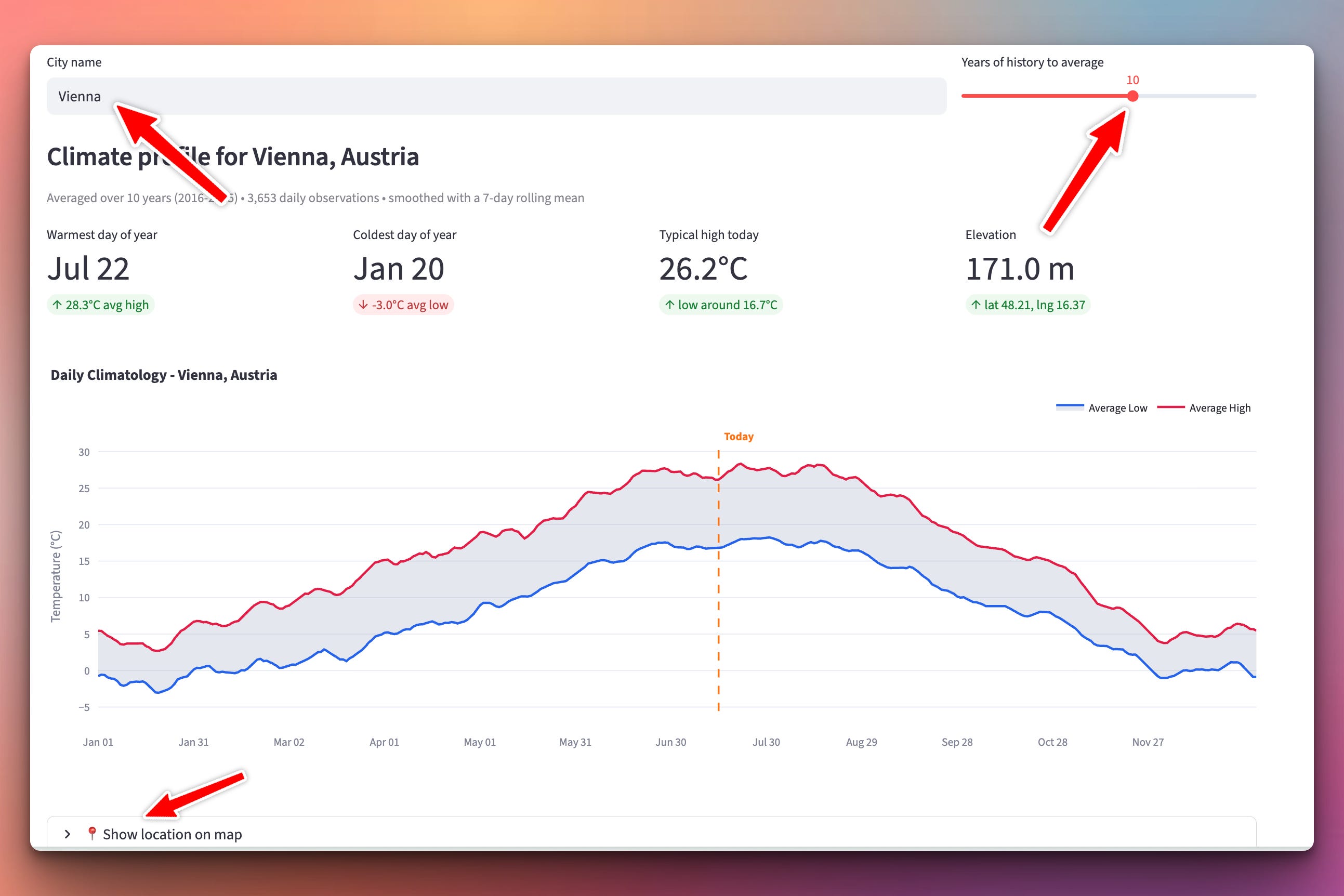
The “Typical high today” card is new — it tells you exactly what a normal mid-July day looks like in Vienna based on 10 years of data. Answers questions like “am I hotter than usual today?” at a glance.
For Vienna, you see the classic seasonal cycle: a smooth sine-like wave peaking in mid-July around 26°C and bottoming in mid-January around -4°C. For Cairo, you see a flatter, higher curve peaking in August around 35°C. For Sydney, the curve is inverted (peaks in January, valleys in July) because it’s the southern hemisphere.
Setup Instructions
Same dependencies as Day 1:
pip install streamlit plotly requests
streamlit run climatology_daily.py
Understanding Grouping by Day-of-Year
Yesterday we grouped by month (12 buckets). Today we group by day-of-year — the integer position of each date within its calendar year, from 1 (Jan 1) to 365 (Dec 31).
The idea is beautifully simple: every Jan 15 across every year goes into the same bucket. Same for Feb 3, and July 14, and December 25. After 10 years of data, each bucket has ~10 observations. We average within each bucket → get the “typical” temperature for that calendar day.
buckets_max = defaultdict(list)
buckets_min = defaultdict(list)

for date_str, tmax, tmin in zip(daily["dates"], daily["max"], daily["min"]):
    doy = day_of_year_no_leap(date_str)      # "2020-07-14" -> 195
    if tmax is not None:
        buckets_max[doy].append(tmax)
    if tmin is not None:
        buckets_min[doy].append(tmin)

avg_max = [_avg(buckets_max[d]) for d in range(1, 366)]
avg_min = [_avg(buckets_min[d]) for d in range(1, 366)]
Same defaultdict(list) pattern as yesterday — just with 365 buckets instead of 12. The universality of the “bucket-and-average” pattern is worth appreciating: it’s the same shape whether you’re aggregating temperatures by day, sales by category, or website visits by hour of day.
Understanding the Feb 29 Problem
Leap years have 366 days. Non-leap years have 365. So Feb 29 exists in some years but not others.
If we naively used the “true” day-of-year:
Mar 1 would be day 60 in non-leap years and day 61 in leap years
The bucket for “day 61” would mix Mar 1 (leap) with Mar 2 (non-leap) — polluted data
Feb 29 would have ~2 data points (from leap years only) while other days have ~10 — massively unbalanced
The cleanest fix is to use a 365-day calendar and collapse Feb 29 into Feb 28:
def day_of_year_no_leap(date_str):
    y, m, d = int(date_str[0:4]), int(date_str[5:7]), int(date_str[8:10])

    # Handle the leap day: treat Feb 29 the same as Feb 28.
    if m == 2 and d == 29:
        d = 28

    days_before_month = [0, 0, 31, 59, 90, 120, 151, 181, 212, 243, 273, 304, 334]
    return days_before_month[m] + d
Now every calendar day gets ~the same number of data points, Mar 1 is always day 60, and Feb 29’s 2 or 3 observations quietly merge into Feb 28’s bucket. Data integrity preserved.
This is what “handling edge cases correctly” looks like in practice. Not fancy — just knowing your data well enough to spot the trap before it bites you.
Understanding the Rolling Mean
Even with 10 years of data per bucket, our daily curve is still noisy. A random cold snap in July 2019 will make July 14 look colder than July 13 in the raw average. Look at any real climate data closely and you’ll see this daily jitter — it’s not signal, it’s noise.
The fix is a rolling mean — replace each day’s value with the average of it and its neighbors. Our version uses a 7-day window:
def rolling_mean(values, window):
    n = len(values)
    half = window // 2
    smoothed = []
    for i in range(n):
        window_vals = []
        for offset in range(-half, half + 1):
            j = (i + offset) % n         # wrap Dec 31 <-> Jan 1
            v = values[j]
            if v is not None:
                window_vals.append(v)
        if window_vals:
            smoothed.append(sum(window_vals) / len(window_vals))
        else:
            smoothed.append(None)
    return smoothed
Three ideas worth understanding:
The window size matters. 3 days = still noisy; 30 days = over-smoothed (real seasonal transitions get flattened). 7 days is the sweet spot for daily climate data — one week worth of neighbors on each side.
(i + offset) % n— the wraparound trick. December 30’s smoothed value legitimately includes Jan 1’s data because climate is cyclical. Without the modulo, Dec 30 would have half a window (only left neighbors) and look artificially bumpy. This little detail is what makes the curve seamlessly continuous.Skip None values in the window — even if some day has no data, the rolling mean fills in gracefully using its neighbors.
In our tests: the raw curve had a day-to-day wobble of 1.05°C. After smoothing, it dropped to 0.20°C — an 81% reduction in noise, with the seasonal shape completely preserved.
Understanding the “Today” Marker
Adding a vertical line at today’s date is one Plotly call:
today_i = today_doy() - 1
today_label = doy_to_display_date(today_i + 1)

fig.add_vline(
    x=today_label,
    line_width=2,
    line_dash="dash",
    line_color="#f97316",
    annotation_text="Today",
    annotation_position="top right",
    annotation_font_color="#f97316",
)
add_vline draws a full-height vertical line at the given x-position, with an optional annotation. line_dash="dash" makes it dashed — visually distinct from the temperature curves. The annotation floats near the top of the chart.
This is the contextualization trick that makes the chart feel alive — without the “Today” marker, you’d have to eyeball where you are in the year. With it, the current moment is obvious at a glance.
Understanding X-Axis Tick Reduction
If we told Plotly to show every one of our 365 x-axis labels, they’d overlap into an illegible blur. We manually pick ~12 evenly-spaced positions and only label those:
tick_positions = [(m - 1) * 30 for m in range(1, 13)]      # ~monthly
tick_text = [doy_to_display_date(p + 1) for p in tick_positions]

fig.update_layout(
    xaxis=dict(
        tickmode="array",
        tickvals=[x_labels[i] for i in tick_positions],
        ticktext=tick_text,
    ),
)
tickmode="array" tells Plotly “use exactly these positions and labels, ignore automatic ticking.” Perfect for cases where the data density on the x-axis is way higher than the labels can accommodate.
The lesson: in charts with many x-values, labels are for orientation, not for identification. 12 monthly labels give the reader “roughly where in the year” without cluttering the picture. The unified-hover tooltip gives them the exact day when they want it.
Understanding the Combined Effect
Look at the full transformation from Day 1 to Day 2:
Day 1 chart:
12 discrete monthly points connected by straight-ish segments
Chunky, looks like a bar chart’s spiritual cousin
Answers “roughly, what does this month look like?”
Day 2 chart:
365 smooth points forming a continuous curve
Shaded band showing the daily temperature range
Today marker for temporal context
Answers “what’s the typical Vienna weather on any given day of the year?”
All of Day 2’s added intelligence lives in the aggregation step. The API fetching is unchanged. The Streamlit layout is nearly identical. Only the middle — how we bucket, how we smooth, how we plot — grew smarter.
This is the same “stable UI, growing intelligence underneath” pattern that ran through Week 25’s predictor. It’s a design principle worth internalizing: your users shouldn’t have to relearn the app because you upgraded the math.
Coming Tomorrow
Tomorrow is the finale — multi-city comparison. Type Vienna, then type Tirana, and watch both cities’ climate curves appear on the same chart with different colors. Which city is hotter in July? By how much? At what point in the year do their temperatures cross? The comparison chart answers all of these visually. This is what WeatherSpark does — and we’ll build it from scratch.
View Code Evolution
Compare Day 2’s daily climatology with Day 1’s monthly averages — same fetch pipeline, same UI shell, but the aggregation step levels up dramatically. That’s how real data apps evolve: not by rewriting from scratch, but by refining one piece at a time.
Keep reading with a 7-day free trial
Subscribe to Daily Python Projects to keep reading this post and get 7 days of free access to the full post archives.