

Weather Climatology Dashboard: Day 3 - Multi-city comparison (WeatherSpark style)
Build a multi-city comparison weather dashboard where users can compare which city is colder/warmer.

Projects in this week’s series:
This week, we build a Climate Dashboard — a Streamlit web app that fetches historical weather data from a free public API and turns it into beautiful climatology charts.
Day 1: Single city, monthly averages
Day 2: Daily climatology with filled temperature bands
Day 3: Multi-city comparison (WeatherSpark style) (Today)
Today’s Project
Welcome to the finale — the recreated WeatherSpark chart.
Days 1 and 2 built the foundation: fetch, aggregate, smooth, chart. But a climatology chart of a single city can only answer questions about that city in isolation. The really interesting questions are comparative:
Is Vienna colder than Tirana in January?
When during the year is the gap the biggest?
Which city has a more extreme annual swing?
Are there any months where they’re at the same temperature?
Today we build the app that answers all of that. Two (or three) cities’ curves on the same chart. Translucent filled bands that show where they overlap. Floating labels on each curve. Prose insights beneath the chart that read the data for you.
Same UI shell as Days 1 and 2. Dramatically more powerful chart.
Project Task
Build the multi-city comparison view:
Two text inputs (plus a third, optional) for city names
Load and process each city using the pipeline from Days 1 & 2
Overlay all cities’ max/min curves on a single Plotly chart
Each city gets its own color palette and translucent filled band
Add floating city-name labels near each curve’s peak
Add a Today marker (like Day 2)
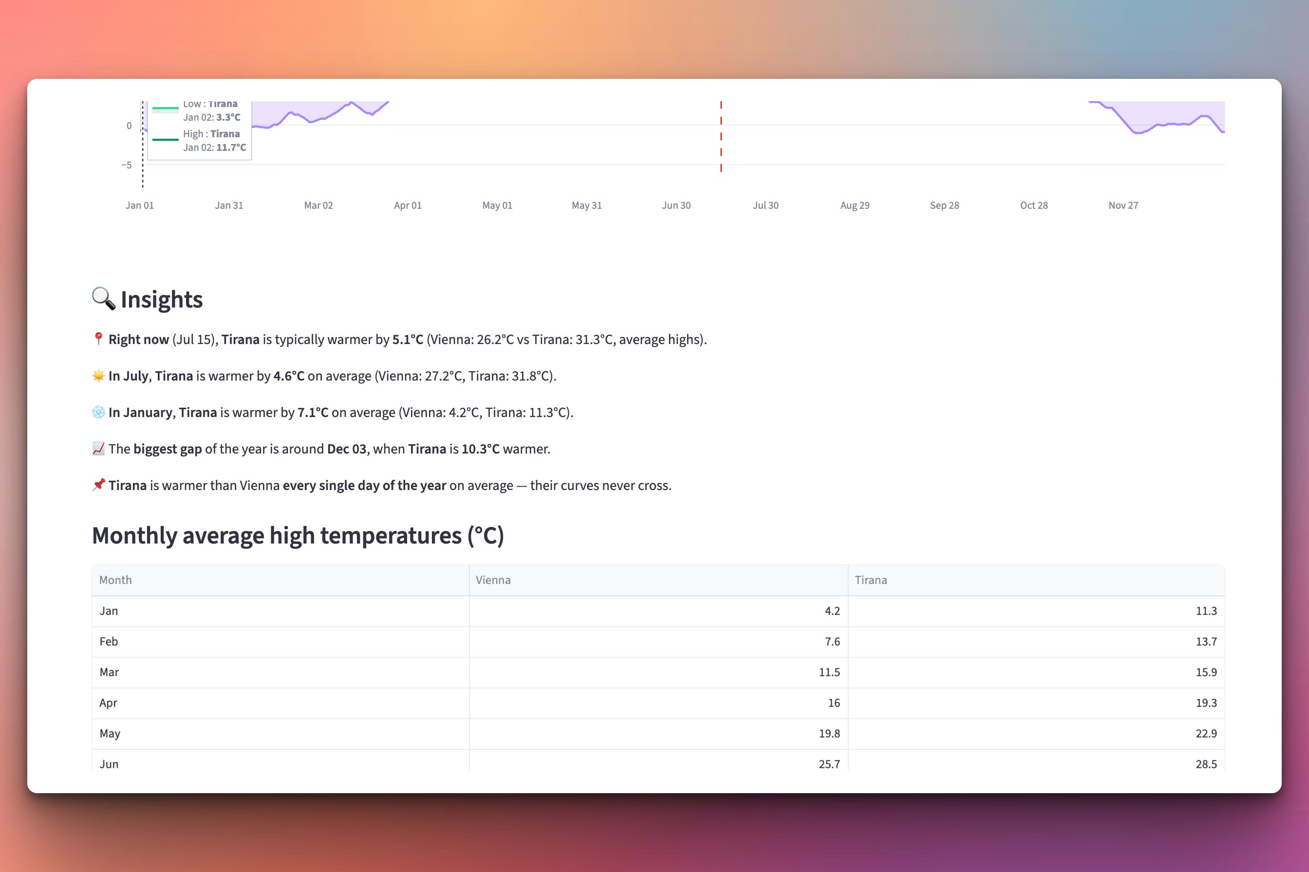
Below the chart: a prose insights section — “Right now, Tirana is 6°C warmer”, “Biggest gap in October”, “Curves never cross”
Below that: a monthly comparison table showing exact numbers
And at the bottom: city info cards styled in each city’s color
Expected Output
Running the app:
streamlit run climatology_compare.py
Type Vienna and Tirana. Here’s what you get:
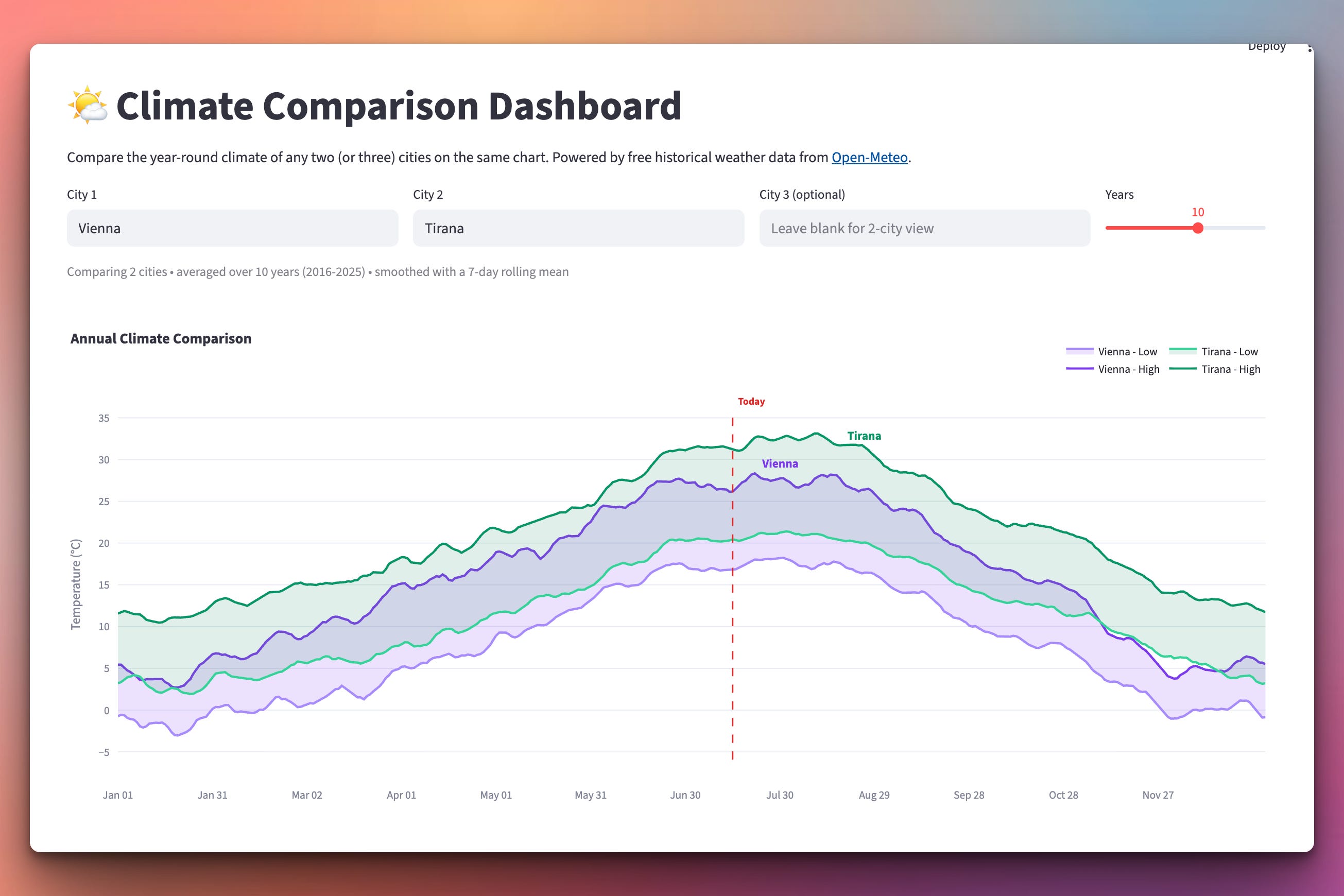
Two smooth curves per city, showing the lowest and highest daily average temperature. Vienna’s high/low in purple, Tirana’s in green. This is a great way to have a feeling of the weather of a city at a certain month by comparing it with your own city.
We also show some more insights below the chart area:
Setup Instructions
Same dependencies as Days 1 & 2:
pip install streamlit plotly requests
streamlit run climatology_compare.py
Understanding Reusing the Day 2 Pipeline
The whole point of the “same UI, growing intelligence” pattern is that we can call our old code with different arguments instead of rewriting anything. Day 3’s Load-A-City helper is literally the Day 1/2 pipeline in a single function:
def load_city_climatology(city_name, years):
    """Fetch + aggregate + smooth for one city."""
    city = geocode_city(city_name.strip())
    if city is None:
        return None

    today = date.today()
    end_year = today.year - 1
    start_year = end_year - years + 1
    start_date = f"{start_year}-01-01"
    end_date = f"{end_year}-12-31"

    daily = fetch_daily_history(
        city["latitude"], city["longitude"],
        start_date, end_date,
        city.get("timezone", "auto"),
    )

    raw_max, raw_min = daily_climatology(daily)
    avg_max = rolling_mean(raw_max, SMOOTHING_WINDOW)
    avg_min = rolling_mean(raw_min, SMOOTHING_WINDOW)

    return {
        "city": city,
        "avg_max": avg_max,
        "avg_min": avg_min,
        "years_range": (start_year, end_year),
    }
Every function called here — geocode_city, fetch_daily_history, daily_climatology, rolling_mean — is unchanged from Day 2. We just wrapped them in a function that returns a self-contained “city bundle” dict. Then we call it once per city:
bundles = []
for name in [city_a, city_b, city_c]:
    bundles.append(load_city_climatology(name, years))
This is the “bundle” pattern in action. Each bundle contains everything downstream code needs (the chart, insights, table) to work with that city. Downstream code doesn’t care how many cities there are — it just iterates the bundle list.
Understanding Overlapping Traces with Individual Fills
Each city needs its own max/min pair with its own filled band. Since we have 2-3 cities, that means 4-6 traces in total. The pattern:
for bundle, palette in zip(bundles, CITY_PALETTE):
    # Max curve for this city
    fig.add_trace(go.Scatter(
        x=x_labels, y=bundle["avg_max"],
        line=dict(color=palette["high"], width=2.5),
        legendgroup=bundle["city"]["name"],
    ))

    # Min curve WITH fill='tonexty' - fills to the previous trace (the max above)
    fig.add_trace(go.Scatter(
        x=x_labels, y=bundle["avg_min"],
        line=dict(color=palette["low"], width=2.5),
        fill="tonexty",
        fillcolor=palette["fill"],
        legendgroup=bundle["city"]["name"],
    ))
Two important tricks:
Trace order matters (same as Day 2). Max first, then min with
fill="tonexty". The fill fills to the previous trace, which is the max curve above.legendgroupgroups both traces of one city together in the legend. Click “Vienna” in the legend and both the max and min curves toggle at the same time. Nice UX detail.
The color palette provides three hues per city — a bold high color, a slightly lighter low color, and a translucent fill color:
CITY_PALETTE = [
    {"high": "#7c3aed", "low": "#a78bfa", "fill": "rgba(124, 58, 237, 0.15)"},  # purple
    {"high": "#059669", "low": "#34d399", "fill": "rgba(5, 150, 105, 0.15)"},    # green
    {"high": "#ea580c", "low": "#fb923c", "fill": "rgba(234, 88, 12, 0.15)"},    # orange
]
The fill alpha (0.15) is crucial. Too dark and the cities’ bands hide each other where they overlap. At 0.15, they blend transparently — you can see both cities’ territory even in the shared middle.
Understanding Floating City Labels
Legends are helpful but require the eye to jump back and forth. Real chart craftsmanship puts labels directly on the data. WeatherSpark does this — so do we, using add_annotation:
for bundle, palette in zip(bundles, CITY_PALETTE):
    avg_max = bundle["avg_max"]
    # Find the day-of-year where this city's max is highest
    peak_i = max(range(365), key=lambda i: avg_max[i] if avg_max[i] is not None else -999)

    # Offset each city's label by a few days so multi-city labels don't overlap
    offset = bundles.index(bundle) * 8
    label_i = min(364, peak_i + offset)

    fig.add_annotation(
        x=x_labels[label_i],
        y=avg_max[label_i],
        text=f"<b>{bundle['city']['name']}</b>",
        showarrow=False,
        font=dict(color=palette["high"], size=13),
        xanchor="left", yanchor="bottom",
        xshift=6,
    )
Two concepts worth internalizing:
showarrow=False— a bare annotation, no arrow pointing anywhere. Just text at a coordinate.xshift=6— nudge the label 6 pixels right so it doesn’t sit on the data point. Small visual polish that makes a huge difference.
The offset = bundles.index(bundle) * 8 line prevents label collision when multiple cities peak in the same month. Without it, “Vienna” and “Tirana” (both peaking mid-July) would sit on top of each other.
Understanding the Smart Insights
The chart shows what the data says. The insights section explains it in prose. This is where Day 3 stops being “just a chart” and becomes a report.
Each insight is generated by comparing two cities’ arrays and finding the answer to a specific question:
def build_insights(bundles):
    insights = []
    a, b = bundles[0], bundles[1]

    # Right now: today's typical difference
    today_i = today_doy() - 1
    diff = a["avg_max"][today_i] - b["avg_max"][today_i]
    warmer = a["city"]["name"] if diff > 0 else b["city"]["name"]
    insights.append(
        f"📍 Right now, **{warmer}** is typically warmer by "
        f"**{abs(diff):.1f}°C**."
    )

    # July vs January comparison
    a_monthly = monthly_averages_from_daily(a["avg_max"])
    b_monthly = monthly_averages_from_daily(b["avg_max"])
    jul_diff = a_monthly[6] - b_monthly[6]
    # ...
Each insight is a few lines of pure data-summary logic. The chart shows what — the insights answer specific questions the user probably had in mind.
Understanding the Monthly Comparison Table
The insights tell you the story; the table gives you the numbers. st.dataframe accepts a list of dicts and renders them as an interactive table:
def build_comparison_table(bundles):
    rows = []
    monthly_pairs = [(b, monthly_averages_from_daily(b["avg_max"]))
                     for b in bundles]

    for m_i, month_name in enumerate(MONTH_NAMES):
        row = {"Month": month_name}
        for bundle, monthly in monthly_pairs:
            row[bundle["city"]["name"]] = round(monthly[m_i], 1)
        rows.append(row)

    return rows

st.dataframe(build_comparison_table(bundles),
             use_container_width=True, hide_index=True)
The dataframe is interactive — click a column header to sort, drag corners to resize. Every real dashboard should have a table below its chart. The chart shows the shape; the table gives you the exact values.
A design principle worth adopting: always pair a visualization with a data table. The chart is for pattern recognition; the table is for verification. Users use both, at different moments.
Understanding What You’ve Built
Let’s zoom out. Compare Day 1 with Day 3:
Day 1: One city, 12 monthly points. Simple, but limited.
Day 3: Two or three cities compared side-by-side, with 365-day smooth curves, filled bands, floating labels, generated prose insights, monthly comparison table, color-coded city cards. The pipeline was extended twice — once for daily granularity, once for multi-city. Nothing was thrown away.
That’s the shape of every real data app you’ll ever build:
Fetch layer: cache-once functions per API
Transform layer: small pure functions that turn raw data into usable structures
Bundle layer: self-contained data envelopes with everything a view needs
View layer: widgets that render bundles into UI
Change the fetch API tomorrow and only the fetch layer needs updating. Add a fourth visualization next week and only the view layer changes. This separation is what makes Streamlit apps maintainable.
What You’ve Accomplished This Week
🎉 Congratulations! You’ve built a complete climate comparison dashboard:
Day 1: Two-API pipeline, monthly aggregation, Plotly basics
Day 2: 365-day climatology, rolling smoothing with wraparound, filled bands
Day 3: Multi-city comparison, prose insights, comparison tables, color-coded cards
You now have:
Two-API chaining — geocode + main data, the shape of every location app
Time-series aggregation — the universal groupby-and-average pattern
Rolling means for noise reduction — with wraparound for cyclical data
Plotly for interactive charts — line traces, filled areas, annotations, custom ticks
Streamlit at intermediate level — text inputs, sliders, spinner, metrics, dataframes, styled markdown
The “bundle” pattern — one data structure per entity, downstream code stays clean
Prose insights generation — reading data programmatically to write sentences
Real-world applications:
Any climatology / seasonality analysis — retail sales by day-of-year, energy consumption by hour-of-day, website traffic by day-of-week
Comparative dashboards — two products’ revenue over time, two competitors’ stock prices, two cities’ any-metric
Any location-aware data app — real estate prices, air quality, restaurant density
Time-series smoothing — the rolling-mean trick applies to any noisy signal
Portfolio piece — deploy to Streamlit Cloud in 5 minutes, share the URL
Next steps:
Add precipitation as a second chart tab
Try other data types from Open-Meteo: humidity, wind, sunshine hours
Build a “best time to visit” view combining temperature, rain, and daylight
Add a city autocomplete using the geocoding API’s
count=5paramDeploy to Streamlit Community Cloud — free, one-click GitHub deploy
You’ve built a fully-functional, deployable climate comparison tool. That’s a real portfolio piece. 🚀
View Code Evolution
Compare Day 3’s comparison view with Day 2’s single-city climatology and Day 1’s monthly averages — same fetch, same aggregate, same smooth. The chart and insights got smarter; the pipeline never changed. That’s the design lesson of the week.
Keep reading with a 7-day free trial
Subscribe to Daily Python Projects to keep reading this post and get 7 days of free access to the full post archives.